
CATA Becomes Tennis Austin: Inside the Rebrand That Signals a New Era for Local Tennis
After decades of serving Central Texas players under the name Capital Area Tennis Association, the organization is officially unveiling a new identity —Tennis Austin—marking the most significant evolution in its 50 year history.
The rebrand introduces a refreshed name, visual identity, and brand guidelines designed to better reflect the organization’s role as the connective tissue of tennis across Austin and the surrounding communities. The new look and feel were developed through a close collaboration between branding firm Brands & People, and an internal rebrand team made up of a small group of CATA staff members board leadership.
Unlike a top-down redesign, the Tennis Austin identity was shaped from within.
A collaborative process from the inside out
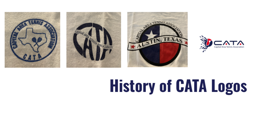
For years, CATA had grown in reach and responsibility—supporting recreational leagues, junior development, tournaments, and community programs—yet its brand no longer reflected the scale or energy of its mission. Multiple logos, inconsistent visuals, and varied messaging across programs made it difficult for players and partners to understand the organization as a single, unified entity.
Recognizing this, CATA’s leadership formed a rebrand working group that included key partners, staff, and board members who collectively represented the organization’s strategic, operational, and community-facing perspectives. This group worked side by side with Brands & People to define what the organization stood for today—and where it was headed next.
Rather than starting with visuals, the process began with discovery: conversations about audience, equity, accessibility, growth, and Austin’s distinctive tennis culture. The goal was not just to modernize the look, but to clarify the organization’s identity.
From Capital Area Tennis Association to Tennis Austin
One of the most consequential decisions was the name itself.
While “Capital Area Tennis Association” carried history and credibility, it often felt formal, cumbersome, and unclear to new audiences. The rebrand team aligned on Tennis Austin as a name that was simpler, more welcoming, and immediately descriptive—placing both the sport and the city at the center.
The new name signals openness and momentum, positioning Tennis Austin as a hub for players of all ages and levels while strengthening its connection to the Austin community.
A brand rooted in community and movement
Brands & People translated these strategic insights into a visual system designed to feel modern, active, and human, mirroring the rhythm and energy of tennis itself. The identity system is flexible enough to support a wide range of programs, from grassroots youth initiatives to competitive adult leagues, while remaining cohesive across digital, print, and on-court environments.
Throughout the design process, the internal rebrand team served as both sounding board and steward, ensuring the new brand honored CATA’s legacy while supporting its future growth. Decisions were tested against real-world use cases: league communications, partner materials, player touchpoints, and community outreach.
As with any collaborative branding effort, balancing perspectives was key. But that diversity of voices ultimately strengthened the outcome, resulting in an identity that reflects the organization’s values rather than just its aesthetics.
Looking ahead
The launch of Tennis Austin represents more than a visual refresh, it’s a statement of intent. With a clearer name, a cohesive brand, and a shared sense of ownership among leadership and staff, the organization is better positioned to grow participation, deepen partnerships, and expand access to tennis throughout Central Texas.
For the partners, staff members, and board leaders who shaped the rebrand alongside Brands & People, the work was deeply personal.
This wasn’t about chasing trends. It was about building a brand that matches the passion, inclusivity, and community spirit that have always defined tennis in Austin, now with a name and identity that make that story easier to see, share, and rally behind.